Fake fur and feathers, textured knits and tweeds, boots, black tights, and billowing coats: behold the autumn wardrobe in all its cosiness. In the fashion calendar, autumn’s arrival is the industry’s biggest money-churning event, as customers flock to restock wardrobes for colder weather and work. Adverts run riot in magazines, boosting the biggest brands alongside proclaimed ‘wardrobe essentials’, which nevertheless seem to change yearly. Soon, luxury fashion knock-offs appear on the high street, allowing all to be suited and booted for the new season.
Inevitably, this surge in profits is anticipated by the entire industry – and nothing heralds its coming quite like the September issue. It is a source of much competition and deliberation: each fashion magazine seeks to release a blockbuster edition in September, outshining competitors by bagging the most illustrious cover star. Vogue, as the established queen bee of such publications, continues to reign supreme with 11.1 million print readers alone. But where Kylie Jenner is now framed by the iconic font (seen on the 2024 September issue of British Vogue) there would have been a stylish illustration a century hence. The 1920s were the golden age of fashion illustration, fusing historical art practice with modern seasonal glamour.
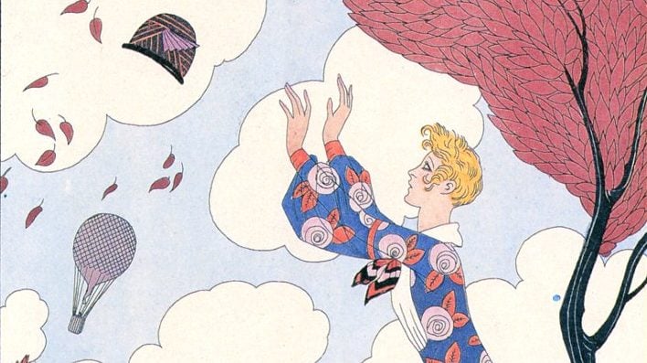
It depicted a fantasy world, but was coloured with enough reality to make it feel obtainable. The lissom silhouettes and lively scenes positively dance with humour – albeit edged with a certain Art Deco hauteur. Instead of a perfectly coiffed Jenner, autumn Vogue covers of this period show women catching leaves or chasing their hats across the park in a relatable reference to the season. Such illustrations make the couture elegance of celebrities seem achievable, without airbrushing autumn’s weather-related quirks. Take, for example, George Barbier’s L’Air image: an unexpectedly windy day is threatening to – or succeeding in – dislodging the hats of pedestrians; yet despite the mishap, they still look fabulous, even as they frantically try to retrieve their headgear.
The magic of fashion illustration lies in its creative freedom: certainly, photographed editorials might be better at selling the clothes, but the camera can only ever depict what’s there in front of it. Contrarily, fashion illustrators can emphasise specific bits or make them up entirely, posing them somewhere between commercial artists and designers in their own right. A 1924 Vogue illustration by George Wolfe Plank evidenced this. Fur-lined and feathered, the model sports a long coat that intentionally – and rather hilariously – resembles a rooster. Huge puff-ball sleeves and talon-like gloves emphasise this zoomorphic effect, with the pictured deer apparently accepting the wearer into its animal kingdom. It is more likely that this garment sprung from Plank’s imagination than any Parisian atelier, but it pokes fun at fashion’s seasonal sales pitch and its never-ending quest for novelty – sometimes to the point of ridiculousness.
Of course, real clothes were depicted too. As fashion photography began to usurp fashion illustration, artists were forced to confront reality and focus on the material. Nonetheless, there is a whimsy to these drawings which no camera can achieve: the real and imaginary are often intertwined, meaning the pictured fashions of 1920s illustration idealise seasonal style. Vogue’s September issues of the 1920s sell a fantasy of everyday life, and yet the illustrated models – chasing hats, catching leaves – seem more relatable than the celebrities pictured on its cover today.


